SELF-BRANDING
BRANDING PROJECT
The focus of this project was to take my identity as a designer and bring it to life with tangible elements. I wanted to focus on some key aspects of defining a brand like logo design, stationary, typography, color palette, visual assets, etc. Throughout this project, not only was I able to refine my personal style, but I also was able to understand myself better as a creative professional.
LOGO
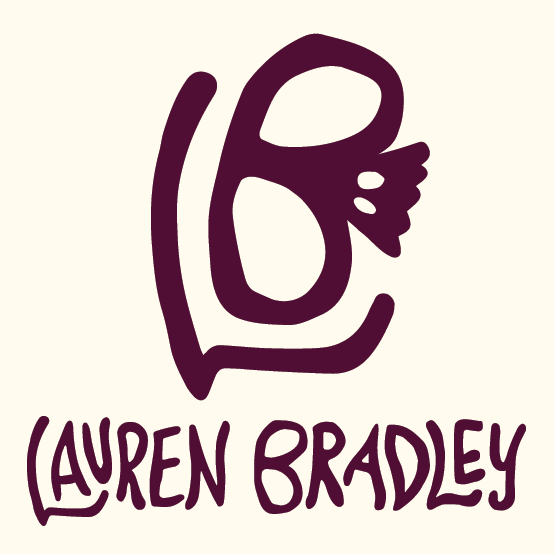
For the logo, I wanted to somehow include a reference to my affinity for human anatomy, particularly skeletons. For me, the skeleton represents the shared human experience because it is something that unifies us. I wanted to include this in my logo to remind myself that inclusivity and authenticity is at the heart of all of my work. By including this symbol, it reinforces the idea that part of my passion as a designer is deeply rooted in forming genuine connections with others, no matter how different our lives may be.
COLOR PALETTE
When it comes to color palettes, I am very drawn to muted jewel and earth tones. I pull a lot of inspiration from the Art Nouveau movement in this way. I also have a strong belief that cream will always look better than white because it adds a classy, antique touch to my work that I simply can't get from white. My work tends to be very high contrast with a more minimal color palette approach, so I wanted to keep that same style in my brand by only using one accent color to enhance its visual impact.
TYPOGRAPHY
In terms of typography, Helvetica has always been my go-to because of how versatile it is. It is also recognized as being the most accessible typeface, which aligns with my commitment to maintain inclusivity in all of my work. I love how strong and bold it is, and since I typically go for more fluid, curved imagery, it provides an elegant, harmonious contrast.


STATIONARY
For my stationary elements, it was important to me that my style was communicated to potential employers without having seen my previous work. I wanted to take a more professional approach while still putting elements of personal touch on them. To do this, I incorporated the light floral embellishment on the corners as a nod to Art Nouveau, and tastefully restrained the burgundy color as to not distract from the content. This attention to detail allowed me to curate a cohesive stationary design while still remaining inside of the professional boundaries.


